About Steve and The Lake House Studio

Steve Duncan is an award-winning Artist. His Lake House Studio specializes in vintage-style design and illustration. Currently Steve is an illustrator developing stationary lines for Carta Bella Paper Company. Along with his work at Carta Bella he accepts freelance projects. His past client list includes Disney Consumer Products, Universal Studios Parks, Williams-Sonoma, Scholastic Books, Inc., Gerber Chidrenswear, October Afternoon, Basic Grey, ModifyInk, and many more. He has served as Art Director at FingerPrints of California and Rebel Entertainment Arts and Licensing, and Creative Director at Suzy's Zoo and Agenda 9.
Showing posts with label Illustrator CS. Show all posts

Wednesday, March 1, 2017

One Month Until My Much Needed Vacation


Cunard's Queen Mary


Sitmar's FairWind
Illustrations © Carta Bella Paper Company

In one month I'm taking my first transatlantic cruise from Florida to Rome, Italy. I'm an avid cruise enthusiast, having been cruising since I was a little boy.

As a cruise enthusiast the planning of the cruise is as exciting as the trip itself. The deck plan above is an illustration that I did for Carta Bella Paper Company's line Let's Cruise. It's a re-rendering of Sitmar Cruise Line's FairWind (later purchased by Princess Cruises in the 80's).

Creating this illustration brought back wonderful memories. The first time I sailed on the FairWind I was 17. I remember taking the cruise brochure with me everywhere I'd go to memorize the layout of the ship. I'd imagine all of the fun that'd I'd have and all of the places I'd hang out. It was a life changing cruise and one of my fondest memories from my youth. I met a group of 10 kids, from all over the world, and for 14 days we traveled all around the Caribbean. We shared experiences of back home and made new memories. Disco was all the rage and from 10pm to 3am every night we'd be upstairs in the Rendezvous Lounge dancing the night away. To this day the voyage still brings a smile to my face.

Now it is on to Rome and new memories. This upcoming cruise will be my 51st cruise. I still have several projects for Carta Bella Paper Company to wrap up before leaving.  Some really fun ones that I hope will become big sellers. More on these projects as they develop.

Chicago's Magnificent Mile


Illustration ©Modify Ink

I love retro travel posters. Ever since I was a teen I have collected them.

I was given a project to design a series of travel posters for Modify Ink. The first poster I designed was of Chicago. At the time I illustrated this my son was living in the windy city.

I wanted the poster to capture the personality of the city.  At first I was going to do a view from of the lake of the city's shoreline. But after a weekend visit  I changed direction and chose a view of the city from within the city. With the focus of the poster being placed on the amazing architecture of Chicago, it became more dramatic and challenging.

The style I rendered it in is a quasi realism interspersed with stylized retro elements like the pedestrians crossing the avenue.  I wanted the sky to have a personality of its own. Instead of a typical light blue fade to darker blue, or interesting clouds floating by,  I chose an dramatic fade of a bold teal to yellow and then into a lighter blue green. I really like how it makes the skyline pop yet and complements the overall design.

The series also includes posters of NY/Washington Square looking down to the Empire State Building, Los Angeles/Santa Monica Pier, and San Francisco/cable car looking out to the bay and Alcatraz. For the San Francisco poster I included the Dolores Street Victorian that I used to live in as part of the homes lining the street.

Wednesday, February 22, 2017

Winter's Coming Back


For a week we've been experiencing springtime temperatures into the low 60'sF.  All the snow is gone and it looks like fall just before winter blows in. The weather forecast for Thursday night into Friday is up to over 12 inches of the white stuff. It's going to be fun.

The above illustrations were created for two different winter lines, the top for Carta Bella Paper Company's Winter Fun and the bottom for October Afternoon's Holiday Style. The city illustration is my interpretation of Minneapolis's Uptown district which is just a canoe ride, in summer, from my studio.

Friday, February 17, 2017

Farmhouse from October Afternoon


 ©2011 October Afternoon


I'm feeling a little bit country today. 

I've been working on a series of country inspired illustrations and looked back into my portfolio for other artwork that I have created in the country style. These images are from Farmhouse by October Afternoon. 

The top illustration was the lines anchor paper. Sadly the bottom image was not used. I really like both of these illustrations. They allowed me to explore new styles to work in.


Sunday, February 12, 2017

Space Cadets Rule!

Riffing off old sci-fi movies and television shows, I've created Space Academy, a fun retro-line of papers, for Carta Bella Paper Company. Here are a few of the illustrations and products. They were all created using Illustrator CS, my software program of choice.

It is an homage to the pioneers of America's Great Space Race. I grew up during this amazing time. My Dad was a Quality Control Director with NASA and he worked on the Mercury, Apollo, Skylab and Spaces Shuttle missions. I loved listening to the behind the scenes stories about the missions that he shared with our family. His home office was decorated with beautiful posters of spacecraft and planets and framed letters from some of the astronauts that he had supported. This project is very dear to my heart.


Roma Poster and Metropolitan Girl Work Ups

I've been spending time this weekend researching an upcoming vacation to Rome. Working on the research this made me think about all of the work ups that I did for Carta Bella's Metropolitan Girl and the ROMA poster that I created.


Above is a preliminary scooter illustration that I did for Metropolitan Girl. When I start on a new project I usually spend a day or two creating "looks" before settling on a direction.
I liked the design and started playing with it as a travel poster. Unfortunately the style was just too different from how the rest of the line progressed and it was never used.


As an alternative to the original scooter illustration, I created an alternate illustration that was used in one of the papers.

Below are some initial figure studies that I did for the line, along with the original scooter illustration.


The line eventually took on a more retro 1950's look.


Thursday, February 9, 2017

Hawaii Dreaming


Illustration ©2015 Steven Duncan, Lake House Studio

Today I'm feeling like I need a little tropical inspiration. February in Minnesota is the beginning of the "I gotta get out of here to defrost" mindset. Luckily, this winter hasn't been all that bad (or maybe I've finally acclimated?)...

I studied art at the University of Hawaii, Manoa, which is just mauka (Hawaiian for "toward the mountains") from Waikiki Beach. I worked at the Royal Hawaiian during my studies and was surrounded by some of the most beautiful and historic Vintage Hawaiiana in public display.

This is a poster that I illustrated and designed a few years ago celebrating all the fun of vintage Waikiki. Whenever I get cold or need a mind vacation I pull out artwork from "Aloha State", a line of Hawaiian stationery products, and I imagine being back home walking down Kalakaua Ave heading for Waikiki Beach.

"A Hui Ho, Waikiki" (Hawaiian for "Until next time, Waikiki").

Winter Work Ups and Amazing Brushes


When I was doing my work ups for Carta Bella Paper Company's line Snow Fun I initially was going to take the line in a more contemporary direction. The theme was going to be all about kids and winter critters.

With this illustration I started to create characters, color palette, look and feel. Though the illustrations were well received in initial reviews we decided to go with a more 1960's retro style.

I had purchased a set of Vector Sketch brushes from Dustin Lee's RetroSupply.com, an amazing resource/online store for any illustrator or designer who wants to make their digital work look hand rendered.

I LOVE RetroSupply's lines of brushes (illustrator and Photoshop), textures, type fonts and cool stuff. I use them all the time in my work. Their products are really priced well, work well and they have great customer service. And if you need some help, many of their products have YouTube tutorials.

Wednesday, February 8, 2017

Welcome to The Great Outdoors and My Family


All Illustrations ©2016 Carta Bella Paper Company

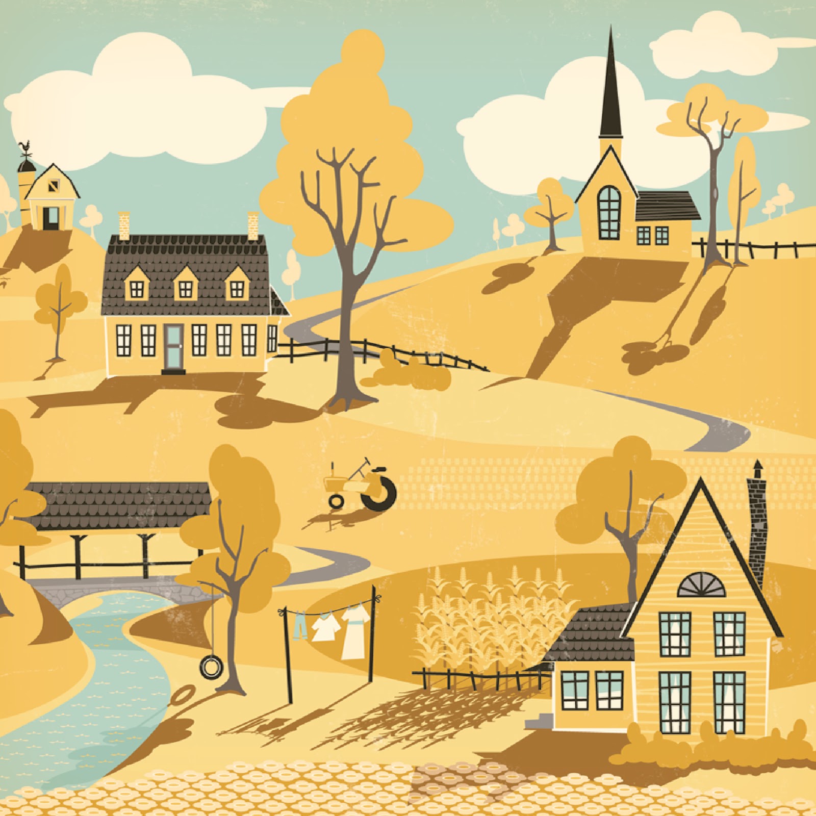
The Great Outdoors was a line of 24 papers plus accoutrements that I produced for Carta Bella. It's all about camping and having outdoor fun. But it's really all about me growing up in a family that loved to camp. Growing up my family were avid anglers. We were out camping and fishing up in the High Sierras on opening day of the fishing season. My grandparents lived just outside of Sun Valley, Idaho so every summer we'd go up to the Big Wood River and fish. I have wonderful memories of my camping days as a child. I still camp today, though I'm not a big fisherman anymore. If I'm not cruising on the Caribbean for vacation you can catch me camping Up North in Minnesota or Wisconsin.


Billy Sue (our trailer)....Growing up we had a small travel trailer with the name Billy Sue (left over from the previous owners) stenciled across the front. The white and blue trailer (top row, left) in the illustration was inspired by Billie Sue. We traveled all over the western US with her. From Yosemite to The Badlands of South Dakota to the Carlsbad Caverns and beyond.


My Brother Tom...This was a fun paper to create. I love badges and icons and was able to put that to good use. As a kid I was a Cub Scout. My older brother was an Eagle Scout and I was always proud of his ability to go so far in scouting. I saw pictures of him with all his badges. He was 20 years older than me so even as a kid, the pictures of him in uniform looked vintage.


My brother-in-law Greg and sister-in-law Kim...They have always dreamed of owning a campground. This is my homage to their dream. I borrowed their pet phrase "Runamok", which they use all the time, to create the camp name. I hope one day that it becomes a reality...and if it does I hope I have an Airstream trailer to come visit their campground in.


My Dad....In this collage of camping images the top left "Fish Fry" image is that of my Dad. At the end of a fishing trip we'd have a huge fish fry. He was very proud of his camp side culinary skills,. Rainbow trout never tasted any better than those fried under the pine trees.


My Brother Tom...When it wasn't fishing season at my brother's house it was prep time for fishing season.  Tom was an amazing fisherman. He knew all of the tricks and nuances to catch the elusive Golden Trout. Hike up to 10,000 feet from base camp to catch one at 4am?...no problem.

As a teenager I'd sit in his garage with him as he made his own flies and lures. We'd talk about his mule packing  rips into the Rocky Mountains and Sierras that he took with my Dad and Granddad when when he was a teenager (when I was a kid we went on cruises...no mule packing trips for my Dad once her hit 50). Tom passed away a few years ago and those memories will always be special to me. I hope he's having fun fishing up there in the Big River in the Sky with my Dad, granddad and Uncles!


Did anyone say trout?


My Dad...As a kid my dad was an aerospace engineer. He worked with NASA on the Mercury, Apollo, Skylab and Challenger missions. When we'd go camping we'd sit by the campfire and look up to the starts. he's point out the constellations and a few satellites that flew by. Wonderful memories.


My Mom...Sometimes my Mom would bring Paint-By-Numbers with us on long camping trips. I'd sit at the camp table with her and work on one of them with her. This is an illustration of Half Dome in Yosemite...it was inspired by all of the Paint-By-Numbers paintings that we did together when I was a kid. I believe that doing all those paintings helped me later in my career with selecting color and isolating color blocks.


Aunt Cleo and Mom....When we'd go on camping trips it was usually a huge family event. Many of my Aunts and Uncles and cousins would join us and it wouldn't be unusual to have 70 people together for a holiday camping trip.  My Aunt Cleo and my Mom loved to pick wild flowers and they'd press them back at the campsite between waxed paper. They were the original Glampers back in the late 1960's. They'd decorate our campsite before Martha Stewart was ever on TV. It was always fun helping them and it made me appreciate all of the beautiful flowers you can find from the alpine meadows to the high desert. Our pressed flower designs were the first greeting cards that I ever made.


Ephemera and stickers that are all inspired by events in my camping life and my family and friends.

Tuesday, February 7, 2017

Art Deco Patterns


Illustrations ©Steven Duncan, Lake House Studio

I created several repeat pattern papers for Putnam & England Co. that were part of a line celebrating NYC. The top illustration is a series of Chrysler Buildings that are strategically scattered throughout the paper.

It's Carnival Time


Illustrations © 2011 October Afternoon

These were some of my favorite illustrations to design just because of the challenges involved in rendering them.  They are part of a stationery program by October Afternoon called Midway. The top illustration is an alphabet paper consisting of 37 separate photorealistic illustrations of carnival signage.  All of the illustrations were rendered using Illustrator CS.

Sunday, February 5, 2017

Summer Vacation Project


Illustrations ©2016 Steve Duncan, Lake House Studio

Over last summer I took several weekend camping trips Up North, into upper Minnesota, Chicago and Illinois. Along the way I saw some amazing vintage neon signs for motels, bars, and other things. I took a lot of pictures and when I returned home I started a study in rendering the images photo realistically using Adobe Illustrator CS. I also found some images online which I have incorporated into the series. I started with the series with the Gain Belt sign, a historic landmark in downtown Minneapolis. Later I incorporated a few of the illustrations into my Carta Bella line Are We There Yet?